
Knowledge Centre.
Artwork Checklist
A quick overview before sending to us:
Colour: File supplied in spot or CMYK to suit the type of printing
Text: Fonts to be converted to paths/outlines
File Type: Saved as .pdf either with the template or without
Resolution: Your images must be high enough quality (600dpi minimum)
Bleed and margins: Ensure artwork extends beyond the template
Size: Check the dimensions of your file match the product
Proofread: Please ensure all text, addresses, phone numbers are correct – you know exact information better than we do!
Where do I send my artwork?
- Send your artwork to sales@duraweld.co.uk with your order reference number.
- For files larger than 5mb use an upload service like wetransfer.com
Artwork Setup
A breakdown of what some of the terms mean and why we need them in certain formats and styles:
Two Versions
- Ideally, we’d like two versions of the artwork, with the template and without. Either way we need at least one version.
- If in doubt, our templates can be found in our Documents & Downloads section (scroll down).
Text Paths and Outlines
- To ensure your text is displayed exactly as you intended we always prefer to receive your artwork with the text converted to paths.
- This avoids complications for missing fonts or on occasion when fonts are imported incorrectly.
- Either scenario would impact the final output of your design.
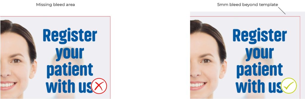
Bleed
- Bleed describes the images or elements that extend beyond the trim edge leaving no white margin.
- The artwork is printed on a larger piece of material that is trimmed or manufactured to size.
- This ensures your design extends fully to all edges of the finished product.
CMYK vs RGB
- Printers use Cyan, Magenta, Yellow, and Key (black), also known as CMYK, ink to print images whereas a monitor uses red, green and blue (RGB) light to display an image.
- With everyone using different monitors, with varying screen resolution, it’s important that we have the CMYK versions to ensure consistency, as these colours don’t change.
- There are a number of tools online that can help identify your CMYK colours if you don’t know them or aren’t sure if you’ve got it right.
Quiet Zone
- When supplying artwork to us, leave a margin of 5mm or more inside the template edge.
- By doing so, this ensures your text or logos fit within the design.
- Any background colours, patterns or images can extend into the bleed area as described above.

Rest assured you will always receive a PDF for approval prior to printing.
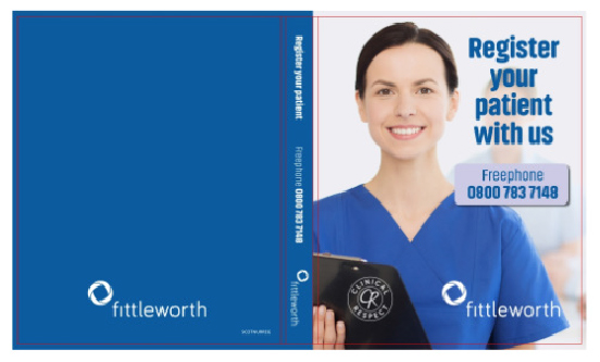
Paper Over Board Wrap-around
- Manufacturing paper over board products is a little like wrapping presents.
- The outer sheet is oversized to allow it to wrap over the edge of the binder to secure it firmly and seal all the edges.
- Your artwork to extend an additional 25mm beyond the products flat size, to ensure sure your artwork wraps around comfortably without any white margins.
- The additional size requirements can be found on the corresponding template.
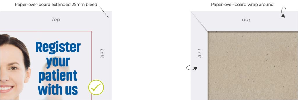
Image Quality and Compression
We’ll always let you know if the image quality needs to be improved when you receive your PDF proof before your product is printed.
We know that this can be a lot to consider, which is why the team is always happy to discuss any image queries you may have. If in doubt, just get in touch.
Low Quality vs High Quality – what you need to be aware of
- When printing we look for images to have a minimum 600 dpi (dots per inch) with none or low compression.
- Often when we receive images, especially logos, they are taken from a website or email footer. These images display fine on a monitor but are compressed to reduce the file size to make them load quicker. Compressing an image reduces the quality either by reducing the resolution or colour range sometimes both.
- A quick indicator of image quality for a jpeg can be the file size, anything less than 500kb is likely low quality.
- There are other factors like the image type, size and number of colours, for example an image with large blocks of colour will have a smaller file size compared to a photo of the same size.
Vector vs Raster
- A raster graphic is made up of a grid of coloured pixels, vs a vector image is created from mathematical coloured shapes called paths.
- Images like gif or jpeg are raster based – ai or svg are vector based.
- Don’t worry – one type isn’t better than the other. Photos are best suited to raster images and text or logos are displayed better using vector.
- Vector image file sizes are usually quite small in comparison to a raster file.
- A benefit of vector images is the resolution is scalable to the size of the print. The same vector logo that is used for a website can easily be scaled to print on a billboard and maintain a clear print.
Next steps and things to consider
Once everything is complete, a PDF proof will be emailed to you for approval, prior to printing.
If you’re unsure and still have questions, then get in touch and a member of the team will be happy to help you.